|
Welcome to the prototype tutorial. Here, you will be guided through a series of tasks to become familiar with Internet-based geographic information services and associated online analytical tools by examining the data, tools, and functionality of the prototype. Please follow and perform each of the tasks outlined in this tutorial. You will be asked specific questions about the prototype related to the tasks outlined in this tutorial in a questionnaire administered at the end of this evaluation. As a professional, you are participating in a final expert evaluation that is focused on identifying the usability, functionality, strengths, and weaknesses of the prototype for use in accessing, analyzing, querying, and retrieving hydrologic data for decision-making within water resource management. Your responses in the questionnaire at the end of this tutorial will provide a means for evaluating the likelihood of web-based geospatial information services and analytical tools to be an effective mode of managing real-time surface water hydrology. In addition, the future application of this technology to other hydrologic or environmental data may be influenced by your feedback. |
||||||||||||||||
|
INTRODUCTION TO TOOLS Locate the toolbar that is on the left side of the "Interactive California Hydrology" prototype website (see illustration). The toolbar contains all of the interactive functions that are available for examining, querying, and analyzing the data presented. We can group these tools into the following categories: Information: Real-time, Identify, Query, and Find. Analysis: Measure, Set Units, Buffer, Select, and Clear. INTRODUCTION TO MAP VIEWER WINDOW AND PRESENTATION/NAVIGATION TOOLSNow, locate the center map viewer window. Here, you can interactively use the tools to explore, analyze, and interpret the map data. Initially, the state of California is displayed with major hydrologic units. Note the small version of the map in the upper left corner of the viewer window. This is the Overview Map. When you zoom into the main map, a red box will appear in the overview map to show you where you are. You can move this red box to navigate around the state. Let's try it... Select the "Zoom In" tool Once zoomed in, a red box will appear in the Overview Map (Fig.2). Move this red box to Southern California by clicking on the Overview Map on Southern California. This will display the zoomed in area of Southern California on the main viewer window. When the Overview Map is not being used, it can be removed from the main map to free up space. Click on the "Overview" tool To navigate around California, we need a basic introduction to a few of the Navigation and Presentation tools. These tools will allow us to easily display the map at different scales (close up vs. far away) and move around. The "Pan" tool Similarly, the "Move" tools The "Zoom Out" tool The "Previous" tool Finally, use the "Initial" tool INTRODUCTION TO MAP LEGEND AND DATA LAYERS Locate the section on the right side of the prototype website, currently displaying "Data Layers"(Fig.3). This section is used to display Data Layers information as well as Map Legend information and useful web links. To change the contents of this section from Data Layers to Legend, we use the "Legend" tool The Data Layers section contains a list of all data that is available to display at the current map scale shown in the main map window (Fig.3). By placing a check mark in the square box next to an item in the list (under the "Visible" column), that item will be drawn in the main map window when the "Refresh Map" button is pushed. Let's try it... Currently, Precipitation and Counties are unchecked. Uncheck Major Hydrologic Units. Check Counties and then click "Refresh Map" to redraw the main map to include county boundaries. Now, zoom into San Diego County in Southwestern California. Notice that at this new scale, additional data layers have been added to the list and drawn on the map. In addition to displaying and removing data layers, you can choose a particular layer to be "Active". Only one layer can be made active at any given time. Activating a layer allows you to search, query, select, and identify features within that layer. For example, if you activate lakes, then you can search for, select, and get more information about a particular lake. The data layers that are not active are merely displayed and cannot be interrogated. Let's try it... In the Data Layers list, make Lakes the active layer by placing a mark in the circle next to Lakes in the Active column. Now, lets find some information about a few lakes that are displayed on the main map. Click the "Identify" tool All maps require a legend to define the symbols, colors, and lines used to represent different data. The Legend in this prototype defines the data that is listed in the Data Layers section (Fig.4). Legend information is automatically updated when the Data Layers list is updated. So, if you are having trouble determining which lines are roads versus rivers, the Legend will help!
|
||||||||||||||||
|
DATE |
UPSTREAM SITE |
DOWNSTREAM SITE |
TRAVEL TIME |
MILES PER |
|
June 24 |
0745 |
1130 |
3.75 hours |
2.7 miles/hr |
|
June 28 |
0530 |
0945 |
4.25 hours |
2.4 miles/hr |
D. The end result of the analysis indicates that rafting in this section of the Tuolumne River under current conditions will produce an average speed of 2.55 miles/hr. This type of analysis could be done for predicting peak flood event times at downstream locations and incorporates the influence of current channel conditions on travel times.
TOOLS
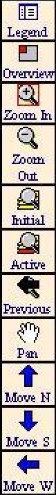
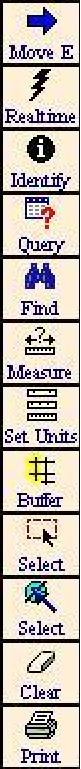
FIG.1
Example of Cursor being dragged over map to designate area to
be zoomed into.
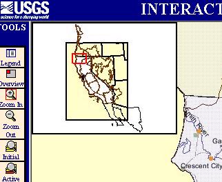
FIG.2
The Overview Map
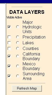
FIG.3
Data Layers
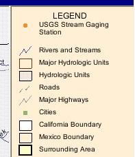
FIG.4
The Legend
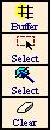
FIG. 5
Buffer, Select,
and Clear Tools
Section II - Free-form exploration of prototype
In this section, no step-by-step instructions are given. Instead, explore the prototype in an attempt to identify any aspects that might be specifically useful to you in your profession. Perform a general decision-making or mapping task and see if you can implement your own spatial-temporal analysis scenario that might be useful for decision-making during flood events. Try to use several different tools in the process.
Section III- Comparison of prototype with existing NWIS-web.
Several web links are located below the Data Layers section of the prototype website. Click on the green "California NWIS Homepage" link. The California NWIS homepage is the current, active homepage of real-time hydrologic data produced by the USGS for the state of California. This homepage includes an interactive map of California with clickable station points that are color-coded to convey current streamflow conditions. Using this map, select the same two stations on the Tuolumne River that were used in the prior analysis. (#11276600 and #11276500). Compare this interactive map with the prototype website side by side and make a note of the advantages and disadvantages of each.

8800 Grossmont College Drive
El Cajon, California 92020
619-644-7000
Accessibility
Social Media Accounts


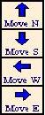 will shift the map in a fixed direction due North, South, West, or East. With these tools, you do not have to click on the map. One click of a "Move" tool will shift the map once in the specified direction. Click on the "Move N" tool. Notice that the map displays a new section to the North with a little bit of overlap to reference the previously viewed section.